Vector logos of New Zealand’s universities
December 28, 2016
Most universities won’t make their logos available in scalable, vectorised version, for unspecified reasons (some universities do, so obviously security/forgery is not the concern). Uni such as Victoria or Cantebury supply their logo in rasterised form with different sizes, colours and the contexts where they should be used. Massey Uni for one, does not. Students and staff have to take a screenshot of the uni’s website and do manual cut paste. Regardless, rasterised logos make a document look much less professional & appealing because of pixelation and inconsistency with the overall design. Luckily, I was able to get my hands on the vector logos of all NZ universities. I share them here along with the technique that allows you to do the same to almost any large institution you want.
Wait, what the hell is vector/scalable graphics?
The pictures you take with your camera (even DSLR with photographic film) are all rasterised, which means they will look blurrier and blurrier when you zoom in, or even out. This is because when you zoom in, you practically ask for more information. Two pixels originally next to each other now 1,2 or 3 pixels apart and the computer needs to interpolate or “make a guess” to fill in the gap. New pixels are added to the bigger sized picture by deducing their colour values from the neigbouring pixels, usually the new pixels will have values equivalent to an average or median value of the neighbourhood.
Vector graphics on the other hand, are not defined by pixel values at all, but instead as functions of lines, shapes and colours in space. For example: line from point A(0.1, 0.2) to point B(0.8,0.9) colour red means: when rendering, define point A at position x=10% the width and y=20% of the height, point B at position x=80% the width and y=90% the height, draw a line from A to B with colour red. This way, the rendering process is the same no matter what the actual size of the graphic is, so it will always look sharp.
If you’re writing an important document (thesis, report, essay…) and wants to make it look as shinny as possible, then you will make sure that the university’s logo displayed sharp and fine to the details. And this cannot be done without scalable graphics, which can be in quite a number of formats, such as SVG, PDF, AI (Adobe Illustrator), EPS (which can be read/saved by many software), WPF (Microsoft’s proprietary), etc,… If you see these extension, then the file is most certainly vector. PNG, GIF, JPEG, BMP, … are not. Don’t use them for your thesis.
Below is a screenshot of my thesis’s front page (yes I actually research how to annihilate mankind using AI ). What happens here is that I changed the logo to unfill the shapes and remove colours, keeping only the strokes (borders) in plain black. It looks perfect when printed. The reason why I removed the fill is because as I explain later, I use the logo without any text to support it so it has to be quite big. The filled shapes emphasises the logo too much that the whole front page is out of balance. Keeping only the strokes makes it look much lighter without loosing its significance.
Where were the treasures hidden?
Just Google “University X svg logo” or go to their Wikipedia page, you might get the vector logo ready made for your convenience. But trust me it is hardly the case for most unis. The place where it is hidden is no other than the university’s website itself, right under your nose. Most universities produce tons and tons of brochures, maps and booklets and most are in PDF format. Of course the institution will make sure that their documents look appealing by using vector logos, so we just need to reverse engine the PDF files to get them. I’ll show you how it’s done in details below. The whole procedure takes about 1-5 minutes if you have the right tool.
What tool?
You need a vector graphic software. I prefer Adobe Illustrator since it has the most user friendly interface of all software out there, and most importantly, I can afford it. However, you should have no problem with Corel Draw and the likes. Even the freeware Inkscape can do it at the same level of ease. The process is basically the same for all of them:
- Go to the university’s website and search for “pdf”, it should give you a ton of documents. A sure place to get one is at the “Campus map” section. Make sure the logo is vector, not bitmap, by zooming in as much as you can and see if it still appear sharp.
- Use Illustrator, Corel or Inkscape to open the page that has the logo.
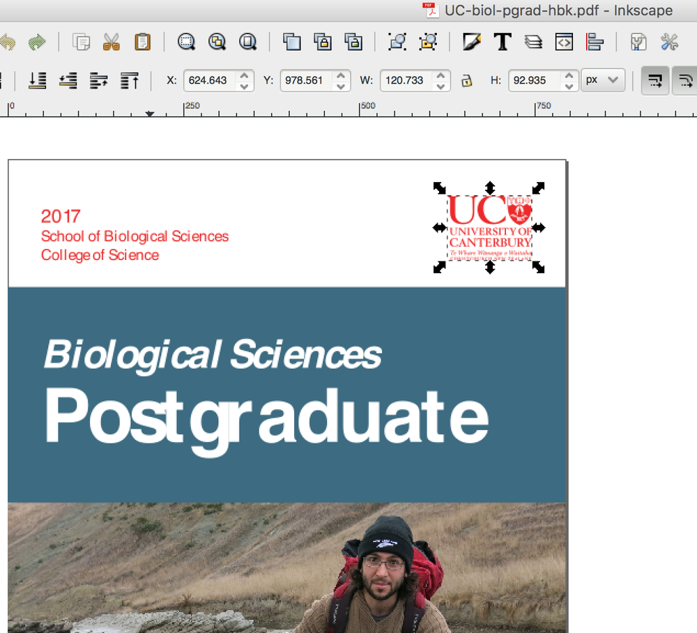
- Sometimes the logo is right there to grab. The screenshot below was taken after I opened a booklet found on the website of the University of Cantebury in Inkscape. You can see that the logo is right there when I click on it. Sometimes it might be a bit tricky if the logo is on top of a complicated background, or if it has many layers. Some graphic skills are required to take the logo out neatly. In my experience, rather than trying to get it out, the easier way is to remove other objects in the document until only the logo is left.
- Now you can copy and paste the logo to another document and resize it to fit the boundary. You should save one original version of the logo, and then if you want to mess with it (change colours, remove fill, add strokes, …), make a copy and go nuts!
Logos of NZ Universities
If you’re from NZ, you’re in luck. I already extracted all the logos of 8 universities, plus Unitec (they’re pretty big & their logo looks cool). To demonstrate the scalability of vector graphics, I’m using svg-pan-zoom to display a small controller in the corner of each image here. You can zoom in and out too see that the pictures look sharp at any scale.
If the text in those logos appear deformed, don’t worry. Many browsers don’t support SVG very well at the moment. They will look good on paper.
Massey University
My uni’s logo is the classic coat of arm design, but the wavy supporters and bright colours make it look kind of gay. Also, why is the ribbon empty when it is the perfect place for the university’s motto (Floreat scientia)?.
A few alternative designs exist. The one displayed here is actually the worse in terms of balance between symbol and words. Don’t put this one on top of your thesis. Use the logo without text instead.
Download it here.
Victoria University of Wellington
I would say this is the best logo out of the bunch. It has the traditional shield, but also two supporters each represents one of two components of the NZ culture (European and Maori). The whole design maintains a perfect balance between being elegant but not simplistic. Although it is the signature university of the Wellington region, the design really is representative for the whole country. With Wellington just happens to be the capital, I can’t think of any better design than this.
Download it here.
University of Auckland
Overall pretty neat & professional looking.
Download it here.
University of Cantebury
The design isn’t bad but I can’t tell what the heck those symbols on the shield mean.
Download it here
Auckland University of Technology
I tried not to be mean, but this is the most boring, monotonous, dull, lazy-ass looking university logo ever. And hey, it’s not even grammatically correct. There’s already a university in AUT, so AUT University is redundant and doesn’t make sense.
Download it here
University of Otago
The flag of Scotland and the Crux, pretty identifiable for the Otago region. The text looks like a classical scientific paper header.
Download it here.
University of Waikato
The only motto that uses Maori instead of Latin, French or English. Again, pretty identifiable for the King’s country.
Download it here
Lincoln University
Nice design overall - But one can’t really tell what’s the story behind those symbols.
Download it here.
Unitec
This logo obviously wasn’t designed long time ago. Looks modern, young and dynamic - but too simplistic, which is typical for young, shallow minded millenia. It comes in two different forms, the one displayed here has text on the right hand side of the logo. There’s another one with text below the logo, which could be downloaded here.
Download the one below here.
If you like this post, please consider sharing with , , , , or leave me a comment below.